Founding Designer • Web & Mobile Apps (B2B)
Duration: 4yrs • Tools: Adobe XD, Balsamiq, Figma, Zeplin
At Toucan, we built the next-generation B2B platform using the latest technologies for banks & aggregators to acquire and manage their merchants. The system had a spirit of modularity and familiarity while giving a fresh vibe.
Over four years at the startup, I worked closely with subject matter experts to grasp business use cases and functionalities. As a founding designer, my design principles were:
A user scans the QR code on the web to make a call.
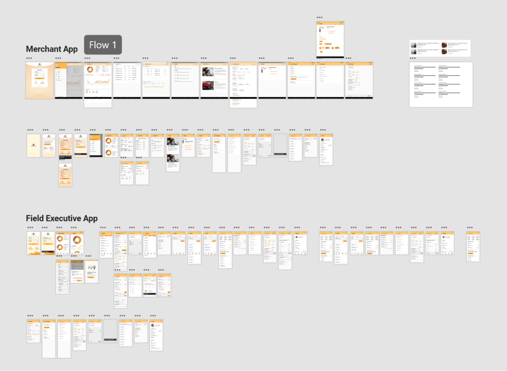
System Thinking. End-to-End Design.
Our startup’s unique selling point was its modular nature. The team and I ensured that the design architecture aims to seamlessly integrate modules with minimal inputs.
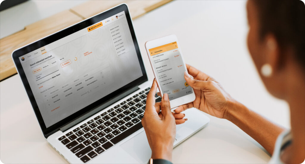
The platform worked on the desktop primarily, while the mobile and tablet apps supported on-the-field processes. For example, we accelerated the sales cycle by designing the onboarding process only on the mobile app.
The design balanced the depth of information across devices while also benefiting from its form, providing a smooth plug-and-play experience.
I used Adobe XD for designing and the Zeplin app to collaborate with the dev team.
Flow chart of one of the systems designed for the mobile app
Repeatability. Intentional Design.
Some modules targeted users at the banks who were well-versed with our system and spent significant time on it. We modified the tabindex flow for repeated tasks, which helped us stay keyboard-centric, reducing their interactions with the mouse and saving their repeated efforts.
The design patterns for Data Representation and navigation pages, Search-results pages, and Cross-module exchanges followed a similar course. The key action components stayed at the same location throughout multiple workflows.
Just one minute saved per person an hour saves about 100 minutes per floor on average.
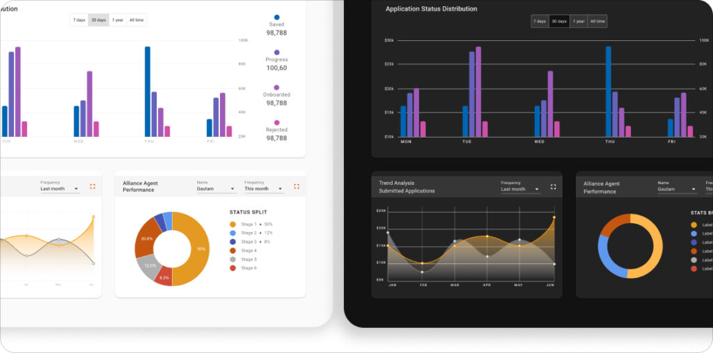
Toucan’s design system was a customized version of Google’s Material Design System. It supported both the light and dark themes with all its components following the WCAG AA contrast ratio.
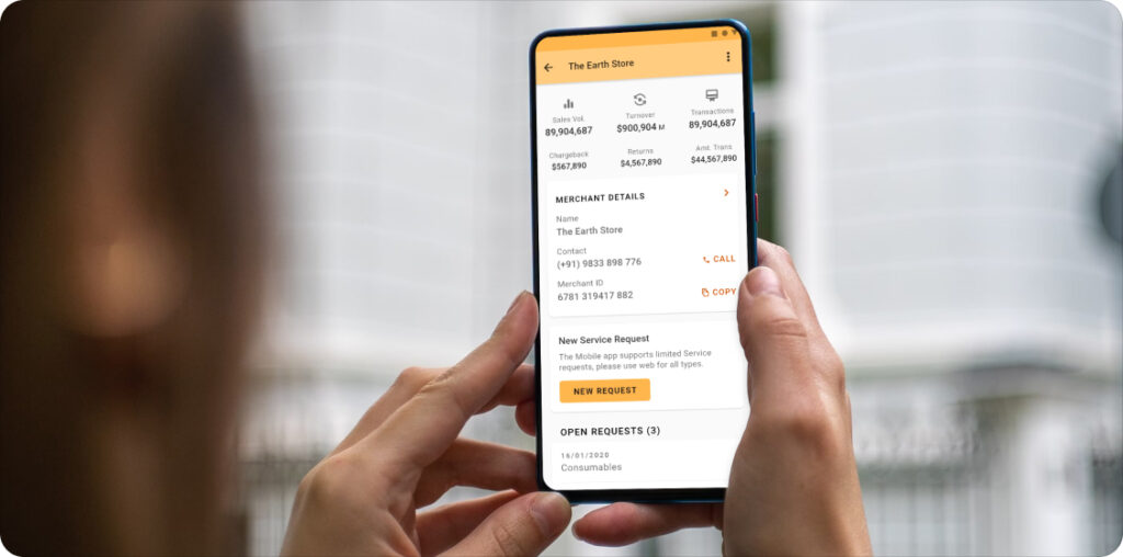
Merchant detailsThe light and dark themes
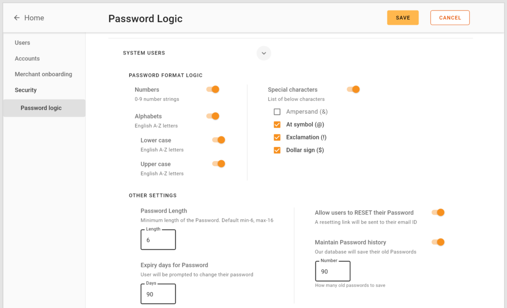
The help moduleA screen to set the password logic complexity for our users.
White-label and Multilingual Designs.
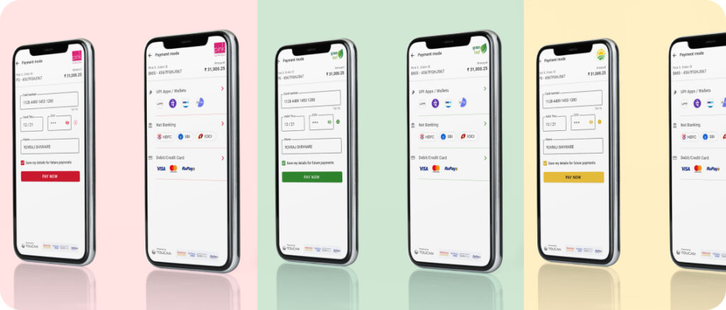
The design system had room to adapt our customer’s branding & style guides. We achieved White labeling by adopting flexible color schemes, layout presets, and specific customizable components, all while ensuring visual and functional balance as per compliance.
During the product’s pilot version, we successfully tested the localization of Arabic and Devanagari languages. The Extensions and Components feature in Adobe XD was handy for this.
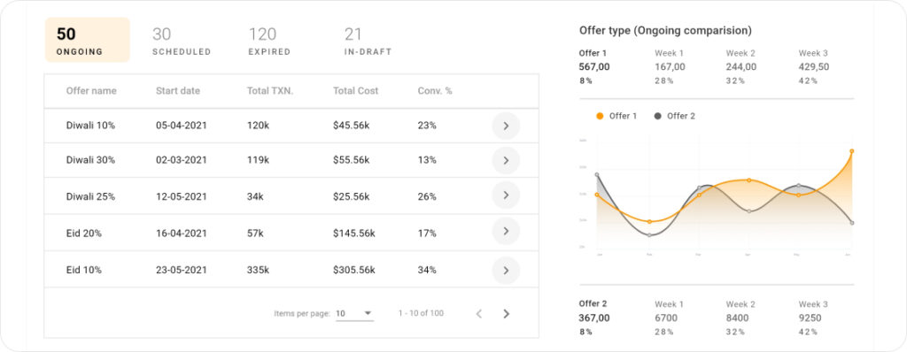
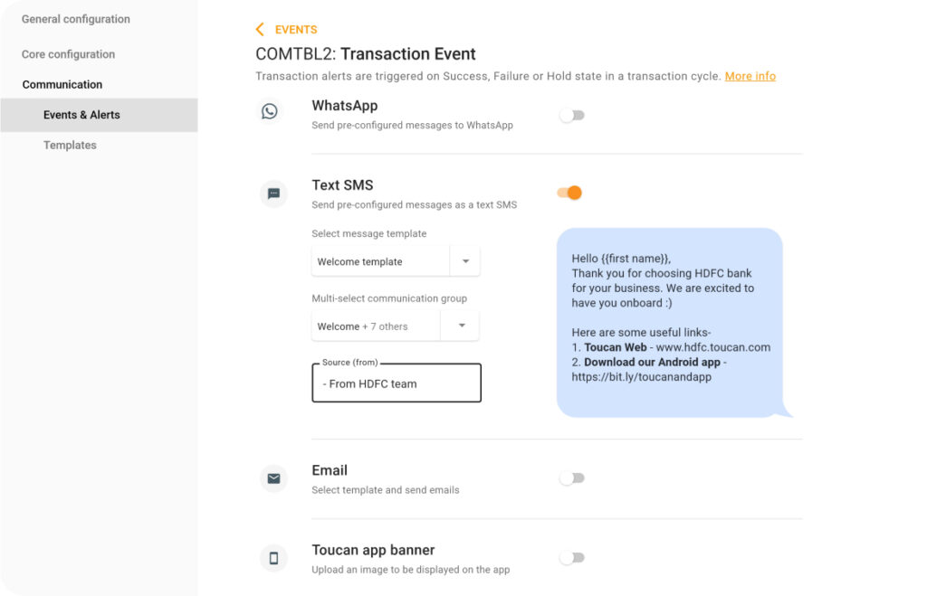
White labeling for various brandsA section from the dashboardScreen to create Communication message templates
Accessibility. For all.
Throughout the design system’s implementation, we ensured all interactive components in both light and dark themes complied with WCAG AAA standards using the Stark tool. At the same time, read-only elements met the AA contrast ratio.
The style guide in our design system was aligned with RBI’s security and regulatory compliance guidelines for fintech, underscoring our commitment to accessibility.
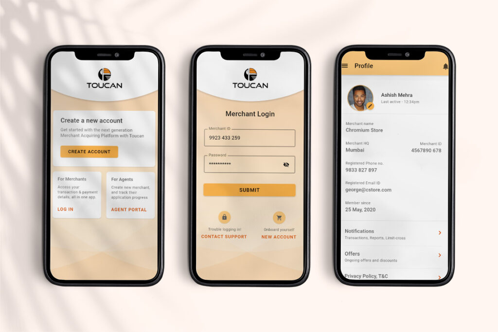
Merchant Onboarding and login
—
NOTE: The NDA contract with the client has restricted the storyteller from sharing more details about the story. Please get in touch via LinkedIn or send me an email to know more.
The help module