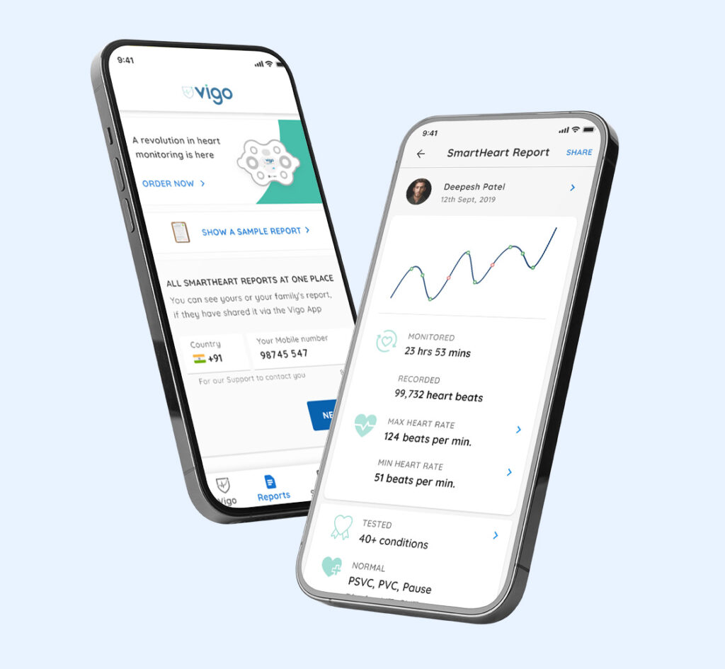
Vigocare is building a remote patient monitoring solution, and SmartHeart is their FDA-approved ECG recording device.
SmartHeart is a DIY patch that sticks onto one’s chest like a band-aid, and wirelessly connects to the mobile app, recording their ECG with 99.3% accuracy for up to 72 hours. The app also captured their physical activities, time-stamp, and location, with their pulses for a more informed decision – helping in early detection and prevention of arrhythmia.
At Vigo, we were trying to make our medical technology – consumer friendly.
1. Who is it for?
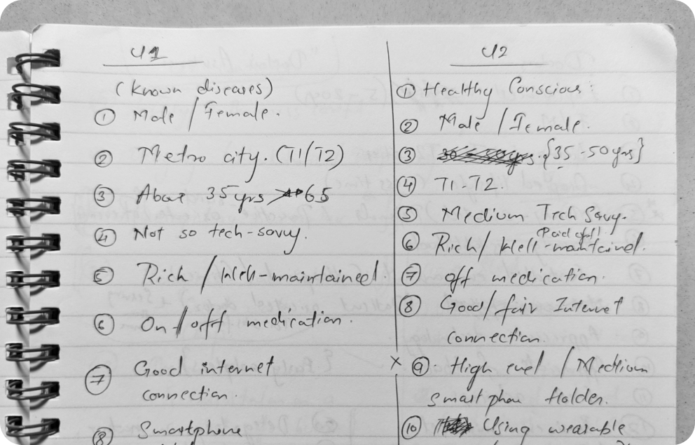
To capture the behavior & traits of our ideal user, I conducted workshops with our core teams. The workshop aimed to answer the question, “Who is it for?”.
We intended to define ‘what’s valuable’ to our users, create personas with the doctors and key stakeholders, and refine them for the design and marketing teams. The outputs of this workshop made a sort of railing guide for the entire designing process, helping us to decide faster and stay focused.
2. What are they looking for?
Later, my research started by observing and interviewing doctors, nurses, and patients in the hospital to understand ‘how things get done in real life,’ ‘the role of a nurse in the whole ecosystem,’ and ‘their priorities.’
The UX research led to my understanding that the ecosystem of Vigo should consider multiple users at multiple stages. A few input points and reports should speak the language of the doctors, while some parts had to account for the busyness of a nurse, their priority of data & its preferential format, and some wording shouldn’t sound alarming to the patient.
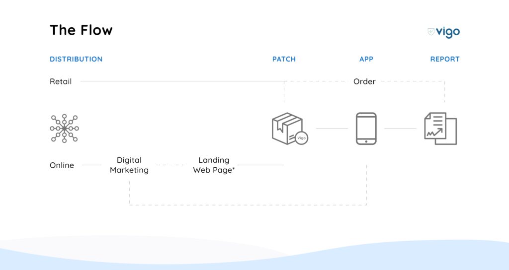
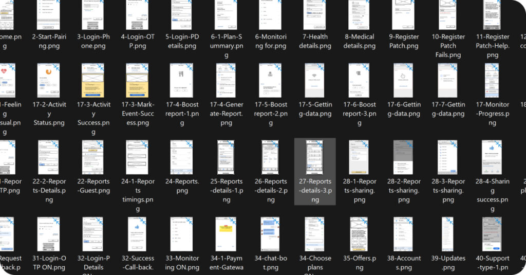
Later, this research helped us reduce their onboarding process from 9 steps (and a phone call) to 5 steps all through the app.
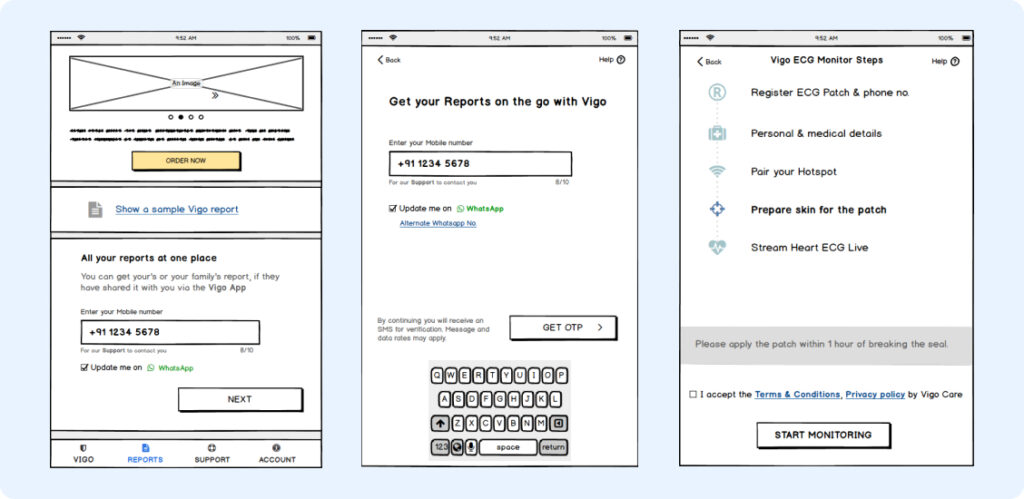
Quick wireframing on Balsamiq from the findings from our research and Prototyping them on the Marvel app helped us get early feedback & re-align our understanding.
My exploration also led to scanning FDA guidelines, frameworks, and HIPAA compliances for creating medical technology.
3. What do they understand?
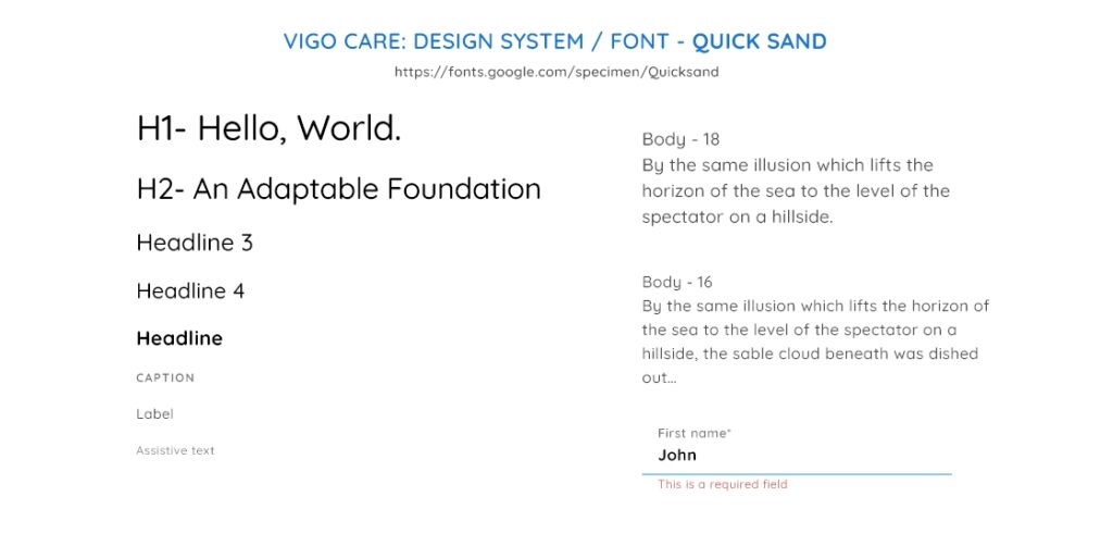
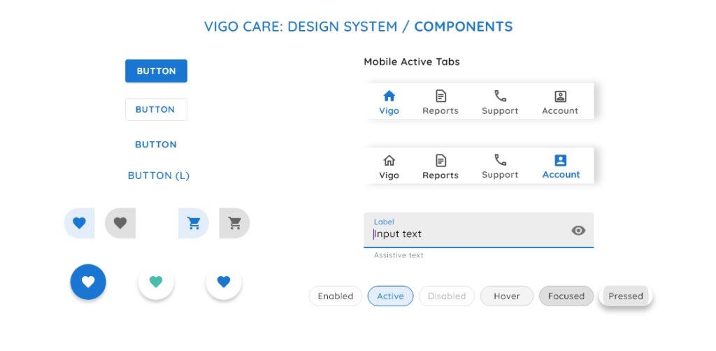
We crafted the language on our app using the principles of UX Writing so our users will quickly understand & follow the technical instructions of our device.
With all the inputs, research, FDA guidelines, and MVP testing, we created the design system for Vigo on Adobe XD. It had a calming and reliable personality. We maintained the WCAG AAA contrast ratio throughout the system.
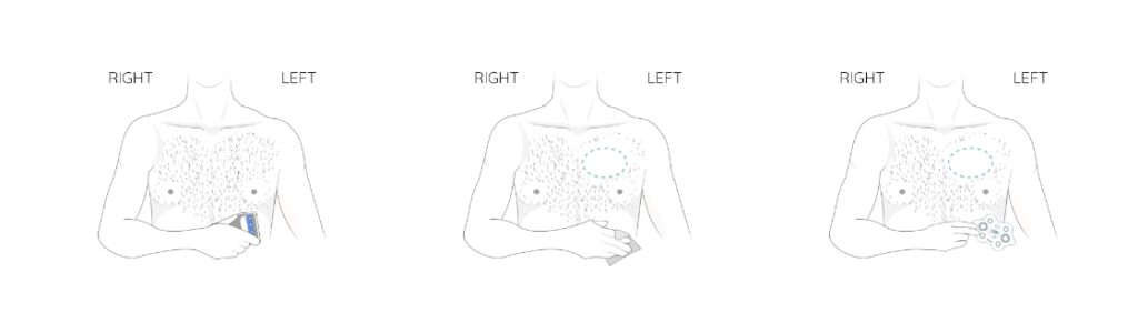
I also developed the storyboards and scripts for the instructional video, animations, and GIFs (figure above) to assist our users further in the flow.
I could sense how the fresh design of the app aligned all the teams and their vision, instilling confidence and excitement as things were taking shape.
It was a humbling experience to work so close to the heart.

—
NOTE: The NDA contract with the client has restricted the storyteller from sharing more details about the story. Please get in touch via LinkedIn or send me an email to know more.